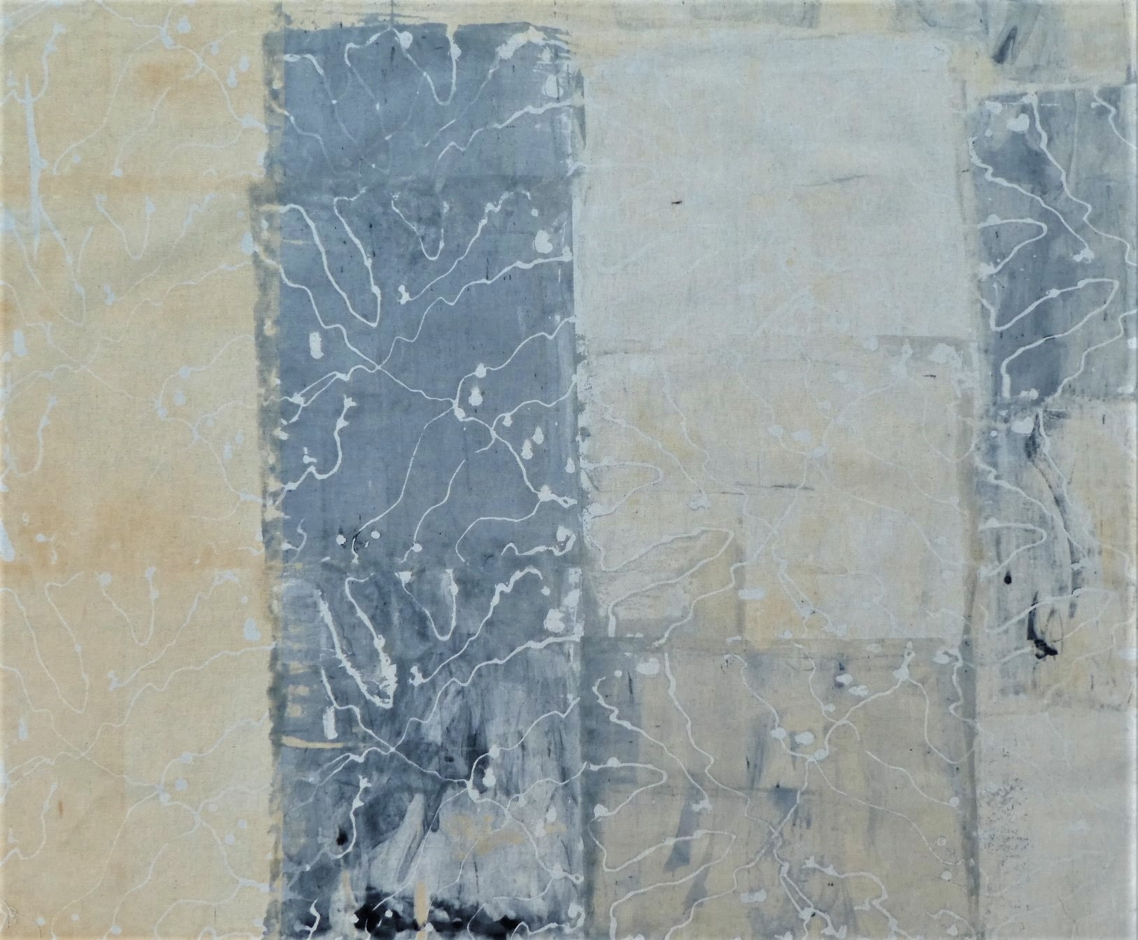
Showing posts with label procion dye. Show all posts

Tuesday, 23 July 2024

More layers of text

In my last post I showed you the fabrics I had printed.  I also dyed two other pieces of calico.

I dyed this piece to use for a different non-text related piece of work - a companion piece to my river hanging.

I used the same colours on another piece of fabric.  I wrote on it first with masking fluid - the sort used by watercolour painters.  This will be another piece in my series based on chains. I used my pantoum poem: Dancing in Fetters

Unfortunately the masking fluid doesn't peel off fabric like it does off paper but that's okay.  However the second problem was that the lettering doesn't show up with the ochre dye as it's too pale.  You can see it if the fabric is held up to the light but the hanging is going to have wadding and a back.


I drew round the letters with an Inktense pencil so that once the wadding and back is on I can see where to stitch.

Next job is to start on this piece of work and use the fabrics from my previous post.  I have two more days of Summer School this week in which to get going.

Thanks for being here today
Bernice

Saturday, 16 December 2023

Studio Day

This week I went to Littleheath Barn Studio for a Studio Day.  This is where you take your own work to do and get the benefit of Liske's advice when you're stuck.

I started work on this new piece by 'painting' the fabric with thickened procion dye.

 
This piece is based on verses from Ezekiel 47:1-12 about the river flowing out.
 
I left it rolled up in plastic for longer than I usually do but still lost quite a bit of the green at the bottom and the rust at the top.
 

In the afternoon I made this grid based on the Australian Connections research I've been doing.

And later this week I worked on this sample from the Maps & More workshop the previous week. It's not particularly satisfactory so it will no doubt be put into my sketchbook.

Thanks for joining me today
Bernice

Saturday, 23 July 2022

Summer School

After an uncomfortable two days of extreme heat for the UK, I spent two cool days (in both senses of the word) at Littleheath Barn with Liske's 'Art Cloth: Maps and More'.

We spent the two days trying out various techniques with a limited palette to produce some fabrics that sit well together.  My colours were basically rust, slate grey and a little charcoal dye.  The aim was to produce fabrics that were dark, medium or light.

Sadly the photographs don't really show the true colours of the fabrics.

For this fabric I put some white acrylic paint through a bought stencil.  I put narrow masking tape on a screen and printed through it.

right side

reverse

Liske had demonstrated how to make a breakdown screen which I used.  It didn't breakdown as much as I thought it would.

right side

reverse

This is muslin which I wrote on with dye.  I scraped dye over the one end and used a thermofax screen on the right.  I cut it into two pieces.  The top part shows the results of using flour paste as a crackle which I put rust dye over.  I scraped pale rust over the the bottom piece.

I used soy wax and drew lines over my screen and scraped dye through the screen.

right side

reverse

I made a screen by spreading a thin layer of flour paste on it.  On one half I put a bought stencil.  On the other half I scraped lines and shapes when the paste was dry.  I also used the stencil to fill in the gaps so I have positive and negatives of the design.

right side

reverse

I scraped dye over this piece of muslin so I have some matching plain fabric.

At the end of the day I had a fabulous piece of dropcloth.  I had started the two days with a new clean cloth.  I cut this piece from the dropcloth and sprayed a soda ash solution over it to fix the dye. It's cotton drill which is heavier than the calico and muslin I had used so it will possibly become a background.

We're back next week for another two days of composition, planning and making using the fabrics. Although we may start with adding more layers of design using fabric paints.

I've no idea what I shall do with all these fabrics.

Thanks for joining me today.
Bernice


Saturday, 2 October 2021

Lots of work

When I was at Committed to Cloth, I pinned all the fabrics I was happy with up on the design wall.  I grouped together the fabrics I had printed at the same time for the most part, but because on the whole I stick to the same limited palette most fabrics go with something else.

I tend to have the Venice or Florida colours of pale blues, turquoise and shades of orange and the canal themed fabrics of petrol blue/green and rust.


I started cutting up the fabrics.  Firstly I cut the those fabrics that could make hangings just as they were starting with these that look like bridges., viaducts or aquaducts.


I took the two fabrics on the right of this photo and cut them both into strips.

I took the strips and randomly put them back together by pinning them on the design wall.  The next task is to machine stitch the strips together and then decide what to do next!

Next I took this breakdown printed fabric and cut it into strips.

And assembled the strips ready to machine.

I took these fabrics and cut them into strips.

And yet again reassembled the strips on the design wall.


Leslie made a suggestion to swap two pieces.  Can you tell which they are?

So now I have a lot of work to do!  I just hope I have enough thread!

Thanks for joining me today
Bernice


Tuesday, 28 September 2021

Committed to Cloth

As a thank you for demonstrating printing techniques at the Festival of Quilts the team was invited to spend a day or days at the Committed to Cloth studio.  I had 3 days available but ended up only using two of them, spending the third day as a day out with Roger.

I took with me all the fabrics that I have printed using breakdown printing, either at Committed to Cloth or at Urban Studio North with Leah Higgins.

Leslie and I looked at all my fabrics and took out those that needed more work.  So on day one I printed over the existing fabric using procion dyes.

Above: the original printed fabric from C2C 2018   Below: Over printed and dyed.  Still not a fan of the fabric

1m x 1.5m

Above part of the origianl fabric printed in 2018 which I thought was too bright.

Below mark making with black dye.  The photograph doesn't show the true colour of the fabric - it is much nearer the colour of the original.

1m square

Above: the original print which had too much white.

Below: with added texture

1m x 0.5m

Above:  the fabric was too pale.  I think the photo above was taken before the print paste was washed out as the fabric was definitely paler than this.

Below: added turquoise and a different screen

1m x 1.5m

Above: part of the original print.  Photo taken before it was washed out.

Below: added colour.  Not sure about it, but I expect it will be fin once it's cut up.

1m x 0.5m 

Next time: all about the fabrics I cut up and reassembled!

Thanks for joining me today.
Bernice